Everyone wants their resume to look good. The font you choose can have a big effect on the presentation of your resume. Some fonts look great on a computer screen. Others look better in print. There are also fonts that look unprofessional no matter how they are viewed.
There are two types of fonts – Serif and Sans Serif. Serif fonts have details at the end of the lines that make up letters. Sans Serif fonts do not have these details. Below are two of the most common fonts:
Serif Sans Serif
The font on the left is Times New Roman and the font on the right is Arial. Serif fonts are common in print and read very well in this format. They are more difficult to read on a computer screen. Sans Serif fonts are much easier to read on a computer screen. When choosing a font, you will need to decide if you want your resume looking best on screen or in print. For most job seekers, a sans serif font will be the best choice since their resume will be looked at much more on screen.
Selecting the type of font is just the starting point. You then need to choose the specific font. There are two primary factors you should consider. First, you want a font that looks good. Second, you want a font that is widely available. There are fonts that are rare and only show up in a few programs. If the reader of your resume does not have the font you choose, the program will try to find a close match. Unfortunately, the close match might not be that close.
One of the fonts that is being used more frequently that is not yet widely available is Calibri. This is the default font in Microsoft Word 2007. It’s a really good looking font. The problem is that older systems don’t have it. I was working on a computer that didn’t have Word 2007 today and opened a file that had been created in it. The system chose a font that looked like a cartoon font (I would show you what it looks like, but it isn’t a common font and you might not have it). The resume looked terrible.
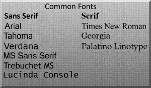
Common Fonts
Sticking with one of these fonts will not guarantee that every reader of your resume will see it exactly the way you want, but it will improve the odds. These fonts are available on more than 90% of the computers on the internet. By contrast, Calibri is on less than half the computers (code style provides statistics on the availability of fonts).
If you absolutely have to use a font that no one else on the planet has, there are options. You can embed the font in the file. Word allows you to do this in the Tools menu under options. Embedding the font will allow a reader of your document to install the font on your system. Not all fonts can be embedded though. Some have licensing limitations that prevent this.
You may be bored with Arial or Verdana, but they look reasonably good. Another font may look better, but may also get replaced with something much worse.
